Pages - Menu

Showing posts with label Sass. Show all posts

Google Material Design Components Undocumented Tricks

Scope

Recently we are migrating from bootstrap to material design by using the Material Design Components for Web. The library is useful but there are some area that are not fully documented. In particular, how to change break points, add extra device type and using media queries.

Code

mdc-layout-grid - change breakpoints

While it is documented for mdc-typography on how to change h1, h2 etc, it is not so the same for mdc-layout-grid.

By default, @material/layout-grid/_variables.scss have the following !default css.

$mdc-layout-grid-breakpoints: (
  desktop: 840px,
  tablet: 480px,
  phone: 0px
) !default;


Went through some of the discussion and found the following variables that would allow me to change breakpoints.

$mdc-layout-grid-breakpoints: (
  desktop: 992px, // some custom value
  tablet: 768px,
  phone: 0px
);

mdc-layout-grid - add extra device type

According to our design, we want to cater for xlarge desktop display, I added an extra breakpoints and getting the following error.

$mdc-layout-grid-breakpoints: (
  xlarge-desktop: 1920px,
  desktop: 992px,
  tablet: 768px,
  phone: 0px
);


There is some hint in the error.in the _mixin line 20, it is returning an error of the following.

@error "Invalid style specified! Choose one of #{map-keys($mdc-layout-grid-columns)}";

Then I run into another error.


It is necessary to provide all the default parameters in the mixin, and the error will go away.

mdc-layout-grid - media queries

// Private mixins, meant for internal use.
@mixin mdc-layout-grid-media-query_($size) {

We use the Sass Map to get the value from our variables dynamically.

.row {
  @include mdc-layout-grid-inner(
    phone, 
    map-get($mdc-layout-grid-default-margin, phone), 
    map-get($mdc-layout-grid-default-gutter, phone)
  );

  @media (min-width: mdc-layout-grid-breakpoint-min(tablet)) {
    @include mdc-layout-grid-inner(
      tablet, 
      map-get($mdc-layout-grid-default-margin, tablet), 
      map-get($mdc-layout-grid-default-gutter, tablet)
    );
  }
  @media (min-width: mdc-layout-grid-breakpoint-min(desktop)) {
    @include mdc-layout-grid-inner(
      desktop, 
      map-get($mdc-layout-grid-default-margin, desktop), 
      map-get($mdc-layout-grid-default-gutter, desktop)
    );
  }
  @media (min-width: mdc-layout-grid-breakpoint-min(xlarge-desktop)) {
    @include mdc-layout-grid-inner(
      xlarge-desktop, 
      map-get($mdc-layout-grid-default-margin, xlarge-desktop), 
      map-get($mdc-layout-grid-default-gutter, xlarge-desktop)
    );
  }
}

The produced css will have media query targeting different width.


We can then shorten the above by writing our own mixin.

@mixin mdc-layout-grid-inner-media-query($size) {
  @if not map-has-key($mdc-layout-grid-columns, $size) {
    @error "Invalid style specified! Choose one of #{map-keys($mdc-layout-grid-columns)}";
  }

  @media (min-width: mdc-layout-grid-breakpoint-min($size)) {
    @include mdc-layout-grid-inner(
      $size,
      map-get($mdc-layout-grid-default-margin, $size),
      map-get($mdc-layout-grid-default-gutter, $size)
    );
  }
}

.row {
  @include mdc-layout-grid-inner(
    phone, 
    map-get($mdc-layout-grid-default-margin, phone), 
    map-get($mdc-layout-grid-default-gutter, phone)
  );

  @include mdc-layout-grid-inner-media-query(tablet);
  @include mdc-layout-grid-inner-media-query(desktop);
  @include mdc-layout-grid-inner-media-query(xlarge-desktop);
}


Migration from CSS to SASS and SMACSS

Scope

As part of our technical debt clearing exercise, we want to migrate our existing CSS to SASS and introduce a SMACSS / BEM pattern to the system. And here is my checklist.

Setup

Technical

Technically it is not a difficult exercise. SASS is backward compatible with CSS anyway. In my eyes, the difficult part is not just to get the job done but to get the job done right.

First and foremost, we changed the extensions from .css to .scss. and started compiling with compass. Previously, we did not have any lint tool for our CSS, so we picked up some syntax error or misspelling such as !impotrant, wasn't so important after all.

SMACSS and BEM

Next part is the refactoring. We opted for the SMACSS pattern because it was easy to follow and was not too much effort to implement as part of the refactoring. I would totally voted for BEM too, but it was more effort involved to change the DOM, so we left at that.

Multi Tenants

By using variables or mixins in SASS, multi-tenant projects that share the same code base or DOM elements will find that the ease of changing all base settings in one centralized _variable.scss can be very intuitive.

For example, base fonts can be changed easily without a big gun of find and replace.

$font-family-sans-serif:   'Gotham Book', Arial, Helvetica, sans-serif;
$font-family-serif:    Georgia, 'Times New Roman', serif;
$font-family-base:     $font-family-sans-serif;
And reference code will be the same across multi-tenants.
.btn { 
  font-family: $font-family-base;
}

Mobile First

We were using the older version of bootstrap and version 4 has been and still on alpha release, so we ditched bootstrap and had a fresh start using bourbon and neat.

Instead of using media queries to target mobile audience, we took the mobile-first approach and our CSS is built on mobile experience, then using media queries to target tablet and desktop where we see fit.

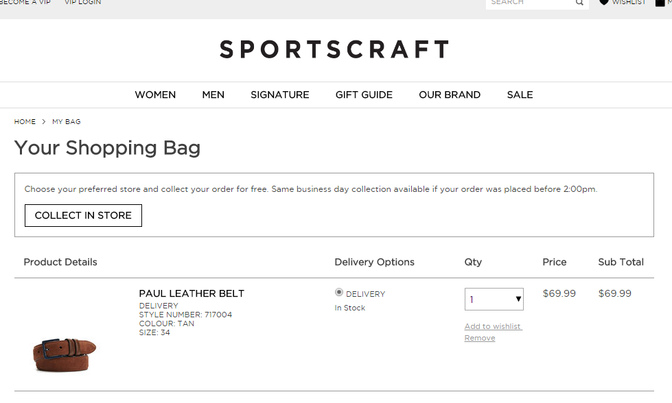
For example, our mobile design for the cart page looks like this. The COLLECT IN STORE button is full width and looks fine.


However, the button is too long on desktop.


We can change the styling by using media query.

@media (min-width: 768px) {
  #clickandcollect-button {
    display: inline-block;
    width: initial;
  }
}

And the width will reset to initial depending on screen width.


SCM

If you are using any SCM, you will need to ignore the .sass-cache folder. We use git so in our .gitignore, we need to add one line.

**/.sass-cache/**

Thoughts

Migrating from CSS to SASS can be value added to any type of projects. It fits both agile or waterfall teams because CSS can fallback as SASS during the compress compilation. The code will not look too ugly and still production-worthy while migration in progress.

As part of our refactoring process, we removed all the legacy !important in CSS which was very !important for me!

Migrating a Website from Bootstrap 2.x to 3.x with SASS and AngularJS

 Scope

My photography website was developed by using Bootstrap 2.x. Here are some technical details about my site.
  • A small website with less than 10 HTML pages.
  • Hosted on AWS S3 with static content only.
  • Since it is on S3, there are no backend languages allowed. C# or php are off the limit.
  • Contact Us form is a 3rd party service iframed somewhere else.

I was quite happy with it for several reasons.
  • Responsiveness.
  • Simple and efficient with no backend developments.
  • Extremely cheap and fast with AWS S3.
  • Does the job well for my purpose. 
  • UX score of 100 by Google PageSpeed Insight


Unfortunately, it has some downsides though.
  • There are no one header and footer file for the site. Therefore, a lot of copy and paste to do between pages just for the same piece of code. 
  • The hover status of the nav bar is hardcoded. :(
  • CSS and JS are not optimized.
Recently my designer did a makeover design for my site as she described my site as "dull and boring" :) I thought I might as well upgrade my site to a newer version of Bootstrap as it is more mobile friendly..

Bootstrap

Firstly, we will download our Bootstrap source and extract to our local folder.


According to the spec, I could just use the Bootstrap distribution version for my purpose, but as a developer, I wanted to see what's in the goody bag by getting my hands dirty.

As Bootstrap 4 is moving from Less to Sass, so I've decided to go with the Sass port for a comfort of future compatibility. It is currently at v3.3.5, so this is what we are going with.

Sass (Syntactically Awesome StyleSheets)

Setup

Firstly, we need to install Ruby. Then we will use Gem to install the sass package.

$ gem install sass

Now we will be able to use Sass to compile our css. There are many ways in using Sass.

And a more advanced approach will be using the Compass.

$ gem install compass
$ cd $/bootstrap.sass/assets
$ compass init

After we run these commands, it will install the compass and initialize a compass config file with some stub css files. A message in the console would look like this.


In order to work with the Bootstrap structure, I moved the stub files from $/sass to $/stylesheets, and changed the path as follow.

http_path = "/"
css_dir = "css"
sass_dir = "stylesheets"
images_dir = "images"
javascripts_dir = "javascripts"

Compass commands are quite straight forward. The following command will compile the sass files manually.

$ compass compile

We can also use the watch command to recompile automatically when there are changes made to the the sass files.

$ compass watch


Minification

To minify the css files, we can add a compressed switch in the compile command.

$ compass compile -s compressed

Or we can change the default setting in the config.rb file.

output_style = :compressed

I have also created a callback function that will generate different files for development and production environment by passing in a different switch.

In my config.rb, I will set my output style depending on the environment, and we will append the .min naming convention when compressing.

output_style = (environment == :production) ? :compressed : :expanded

on_stylesheet_saved do |file|
 if File.exists?(file) && (output_style == :compressed)
  filename = File.basename(file, File.extname(file))
  FileUtils.mv(file, css_dir + "/" + filename + ".min" + File.extname(file))
  puts "   minify " + css_dir + "/" + filename + ".min" + File.extname(file)
 end
end

We can now control what to output by switching between development (default) and production.

Map File

In order to generate the map files, it can be done via a switch.

compass compile --sourcemap

Or in my config.rb.

sourcemap = (environment == :production)

CSS Vendor Prefixes

In order to deal with the CSS Vendor Prefixes, and because we chose not to use the Gruntfile from bootstrap, we need to integrate our own Autoprefixer.

By following the Autoprefixer Rails guide, we will install the gem.

$ gem install autoprefixer-rails

And we will add a callback in our compass config.rb as follow.

require 'autoprefixer-rails'

on_stylesheet_saved do |file|
  css = File.read(file)
  map = file + '.map'

  if File.exists? map
    result = AutoprefixerRails.process(css,
      from: file,
      to:   file,
      map:  { prev: File.read(map), inline: false })
    File.open(file, 'w') { |io| io << result.css }
    File.open(map,  'w') { |io| io << result.map }
  else
    File.open(file, 'w') { |io| io << AutoprefixerRails.process(css) }
  end
end

Testing it by creating a new test.sass as follow.

a {
    display: flex;
}

After we compile, we now have a vendor prefix css generated.

/* line 1, ../stylesheets/test.scss */
a {
  display: -webkit-box;
  display: -webkit-flex;
  display: -ms-flexbox;
  display: flex;
}

Compile

In our screen.scss (generated by compass init), we will add this line. This will import the partial bootstrap scss to our screen.scss. We can add our custom scss in this file later on.

@import "bootstrap";

Migration

There are comprehensive migration guide done by the Bootstrap team. There are also conversion tool available that will do the boring part of the find and replace job.

AngularJS

I am also ditching the default bootstrap jquery and using AngularJS. It is just a nicer way for me to manage header and footer without using any backend language like C# or php.

This can be achieved by using UI Bootstrap if done correctly.

I need to make some small changes in our html to remove the default bootstrap / jquery js and include angular and ui bootstrap js.

<!-- include angular js -->
<script src="js/angular.min.js"></script>

<!-- include ui bootstrap -->
<script src="js/ui-bootstrap-tpls-1.3.1.min.js"></script>

<!-- remove jquery and bootstrap js -->
<script src="js/jquery-1.9.1.min.js"></script>
<script src="js/bootstrap.min.js"></script> 

Now I am able to use ng-include to add header and footer.

<div ng-include = "'_header.html'"></div>

Also, an angular based carousel that can render my image gallery.

<div id="carousel">
    <uib-carousel active="active">
      <uib-slide ng-repeat="f in selected.files track by f" index="f">
        <img ng-src="img/{{ selected.folder }}/{{ f }}.jpg" />
      </uib-slide>
    </uib-carousel>
</div>


Sass + Compass compile css with minification and map file


Scope

I am trying to mimic the way how files are generated in the Bootstrap Distribution that contains the css file with minification and the map files by using the Bootstrap Sass.

Compass

When I compile in development mode, I will get the normal css; when I compile in production mode, I will get the minified css.

In my config.rb

output_style = (environment == :production) ? :compressed : :expanded

on_stylesheet_saved do |file|
 if File.exists?(file) && (output_style == :compressed)
  filename = File.basename(file, File.extname(file))
  FileUtils.mv(file, css_dir + "/" + filename + ".min" + File.extname(file))
  puts "   minify " + css_dir + "/" + filename + ".min" + File.extname(file)
 end
end

The output will look like this between development (default) and production.


Map File

In order to generate the map files, it can be done via a switch.

compass compile --sourcemap

Or by setting up in the config.rb.

sourcemap = (environment == :production)