
Scope
As part of our technical debt clearing exercise, we want to migrate our existing CSS to SASS and introduce a SMACSS / BEM pattern to the system. And here is my checklist.
Setup
- Install Ruby Installer
- Install Sass
- Install Compass
- Install Autoprefixer
- Configure Compass
Technical
Technically it is not a difficult exercise. SASS is backward compatible with CSS anyway. In my eyes, the difficult part is not just to get the job done but to get the job done right.
First and foremost, we changed the extensions from .css to .scss. and started compiling with compass. Previously, we did not have any lint tool for our CSS, so we picked up some syntax error or misspelling such as !impotrant, wasn't so important after all.
First and foremost, we changed the extensions from .css to .scss. and started compiling with compass. Previously, we did not have any lint tool for our CSS, so we picked up some syntax error or misspelling such as !impotrant, wasn't so important after all.
SMACSS and BEM
Next part is the refactoring. We opted for the SMACSS pattern because it was easy to follow and was not too much effort to implement as part of the refactoring. I would totally voted for BEM too, but it was more effort involved to change the DOM, so we left at that.
Multi Tenants
By using variables or mixins in SASS, multi-tenant projects that share the same code base or DOM elements will find that the ease of changing all base settings in one centralized _variable.scss can be very intuitive.
For example, base fonts can be changed easily without a big gun of find and replace.
For example, base fonts can be changed easily without a big gun of find and replace.
$font-family-sans-serif:   'Gotham Book', Arial, Helvetica, sans-serif;
$font-family-serif:    Georgia, 'Times New Roman', serif;
$font-family-base:     $font-family-sans-serif;
And reference code will be the same across multi-tenants.
.btn {
  font-family: $font-family-base;
}
Mobile First
We were using the older version of bootstrap and version 4 has been and still on alpha release, so we ditched bootstrap and had a fresh start using bourbon and neat.
Instead of using media queries to target mobile audience, we took the mobile-first approach and our CSS is built on mobile experience, then using media queries to target tablet and desktop where we see fit.
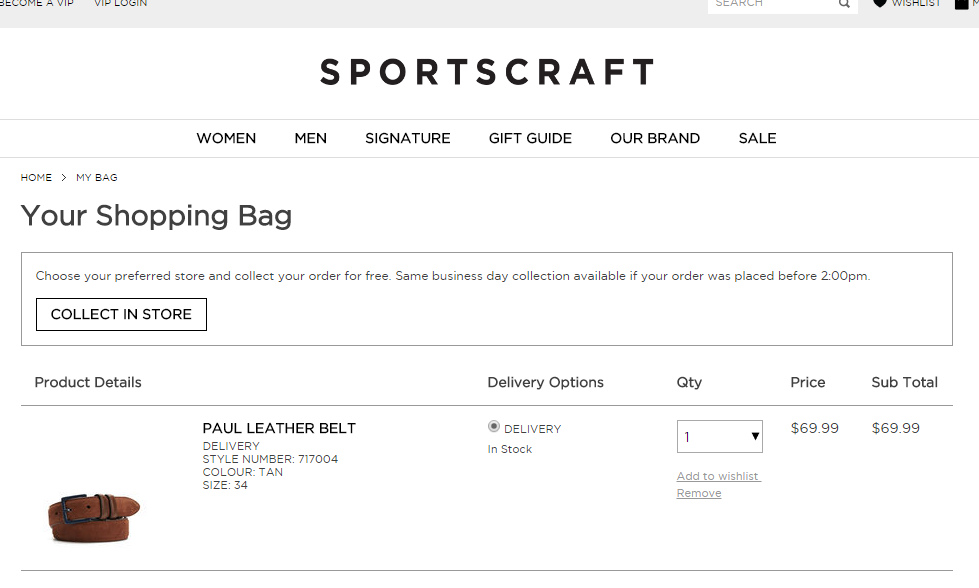
For example, our mobile design for the cart page looks like this. The COLLECT IN STORE button is full width and looks fine.

However, the button is too long on desktop.

We can change the styling by using media query.
And the width will reset to initial depending on screen width.

Instead of using media queries to target mobile audience, we took the mobile-first approach and our CSS is built on mobile experience, then using media queries to target tablet and desktop where we see fit.
For example, our mobile design for the cart page looks like this. The COLLECT IN STORE button is full width and looks fine.


We can change the styling by using media query.
@media (min-width: 768px) {
  #clickandcollect-button {
    display: inline-block;
    width: initial;
  }
}
And the width will reset to initial depending on screen width.
SCM
If you are using any SCM, you will need to ignore the .sass-cache folder. We use git so in our .gitignore, we need to add one line.
**/.sass-cache/**
Thoughts
Migrating from CSS to SASS can be value added to any type of projects. It fits both agile or waterfall teams because CSS can fallback as SASS during the compress compilation. The code will not look too ugly and still production-worthy while migration in progress.
As part of our refactoring process, we removed all the legacy !important in CSS which was very !important for me!
As part of our refactoring process, we removed all the legacy !important in CSS which was very !important for me!
No comments:
Post a Comment