Scope
Recently we are migrating from bootstrap to material design by using the Material Design Components for Web. The library is useful but there are some area that are not fully documented. In particular, how to change break points, add extra device type and using media queries.
Code
mdc-layout-grid - change breakpoints
While it is documented for mdc-typography on how to change h1, h2 etc, it is not so the same for mdc-layout-grid.
By default, @material/layout-grid/_variables.scss have the following !default css.
Went through some of the discussion and found the following variables that would allow me to change breakpoints.
By default, @material/layout-grid/_variables.scss have the following !default css.
$mdc-layout-grid-breakpoints: (
  desktop: 840px,
  tablet: 480px,
  phone: 0px
) !default;
Went through some of the discussion and found the following variables that would allow me to change breakpoints.
$mdc-layout-grid-breakpoints: (
  desktop: 992px, // some custom value
  tablet: 768px,
  phone: 0px
);
mdc-layout-grid - add extra device type
According to our design, we want to cater for xlarge desktop display, I added an extra breakpoints and getting the following error.
There is some hint in the error.in the _mixin line 20, it is returning an error of the following.
Then I run into another error.

It is necessary to provide all the default parameters in the mixin, and the error will go away.
$mdc-layout-grid-breakpoints: (
  xlarge-desktop: 1920px,
  desktop: 992px,
  tablet: 768px,
  phone: 0px
);
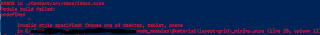
There is some hint in the error.in the _mixin line 20, it is returning an error of the following.
@error "Invalid style specified! Choose one of #{map-keys($mdc-layout-grid-columns)}";
Then I run into another error.
It is necessary to provide all the default parameters in the mixin, and the error will go away.
mdc-layout-grid - media queries
// Private mixins, meant for internal use.
@mixin mdc-layout-grid-media-query_($size) {
We use the Sass Map to get the value from our variables dynamically.
@mixin mdc-layout-grid-media-query_($size) {
We use the Sass Map to get the value from our variables dynamically.
.row {
  @include mdc-layout-grid-inner(
    phone,
    map-get($mdc-layout-grid-default-margin, phone),
    map-get($mdc-layout-grid-default-gutter, phone)
  );

  @media (min-width: mdc-layout-grid-breakpoint-min(tablet)) {
    @include mdc-layout-grid-inner(
      tablet,
      map-get($mdc-layout-grid-default-margin, tablet),
      map-get($mdc-layout-grid-default-gutter, tablet)
    );
  }
  @media (min-width: mdc-layout-grid-breakpoint-min(desktop)) {
    @include mdc-layout-grid-inner(
      desktop,
      map-get($mdc-layout-grid-default-margin, desktop),
      map-get($mdc-layout-grid-default-gutter, desktop)
    );
  }
  @media (min-width: mdc-layout-grid-breakpoint-min(xlarge-desktop)) {
    @include mdc-layout-grid-inner(
      xlarge-desktop,
      map-get($mdc-layout-grid-default-margin, xlarge-desktop),
      map-get($mdc-layout-grid-default-gutter, xlarge-desktop)
    );
  }
}
The produced css will have media query targeting different width.

We can then shorten the above by writing our own mixin.
@mixin mdc-layout-grid-inner-media-query($size) {
  @if not map-has-key($mdc-layout-grid-columns, $size) {
    @error "Invalid style specified! Choose one of #{map-keys($mdc-layout-grid-columns)}";
  }

  @media (min-width: mdc-layout-grid-breakpoint-min($size)) {
    @include mdc-layout-grid-inner(
      $size,
      map-get($mdc-layout-grid-default-margin, $size),
      map-get($mdc-layout-grid-default-gutter, $size)
    );
  }
}

.row {
  @include mdc-layout-grid-inner(
    phone,
    map-get($mdc-layout-grid-default-margin, phone),
    map-get($mdc-layout-grid-default-gutter, phone)
  );

  @include mdc-layout-grid-inner-media-query(tablet);
  @include mdc-layout-grid-inner-media-query(desktop);
  @include mdc-layout-grid-inner-media-query(xlarge-desktop);
}

